Our updated identity brings together two ideas that say a lot about OSP: a small shift in perspective and a creature with a very hands-on approach.
Our logo used to feature a plus. Now, four squares create that same plus in the space between them. It’s still there—you just see it differently.
That space represents our clients. You sit at the centre, with your own expertise, ambitions and challenges. We work around you, bringing the creative thinking, specialist understanding and practical support that help things happen. It reflects how we work: closely connected, flexible and shaped around what you need.
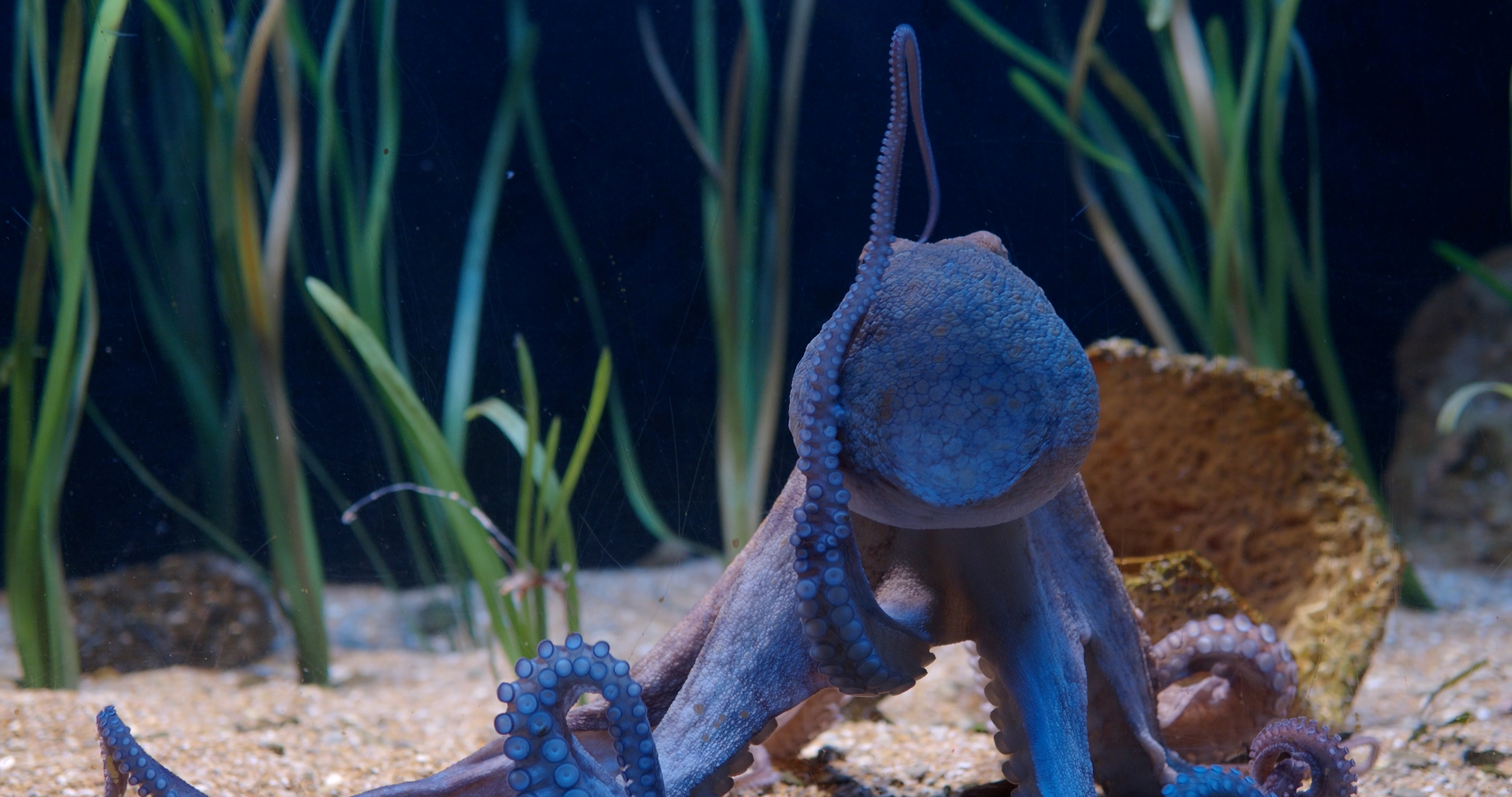
Then there’s the octopus.
Clever, curious and adaptable, octopuses are resourceful problem-solvers. And with eight arms, they’re a fitting symbol for a team that likes to get stuck in.
We recognise something of ourselves in that combination of thinking and doing. Understanding a complex subject, finding a fresh way to explain it, then making everything from the campaign and animation to the learning tools and exhibition stand. Different skills, working together.
After more than 30 years, that’s still what makes us tick. Our new look gives it a clearer expression: clients at the centre, creative minds around them, and plenty of hands ready to help.